Project
Clipping Magic Webapp
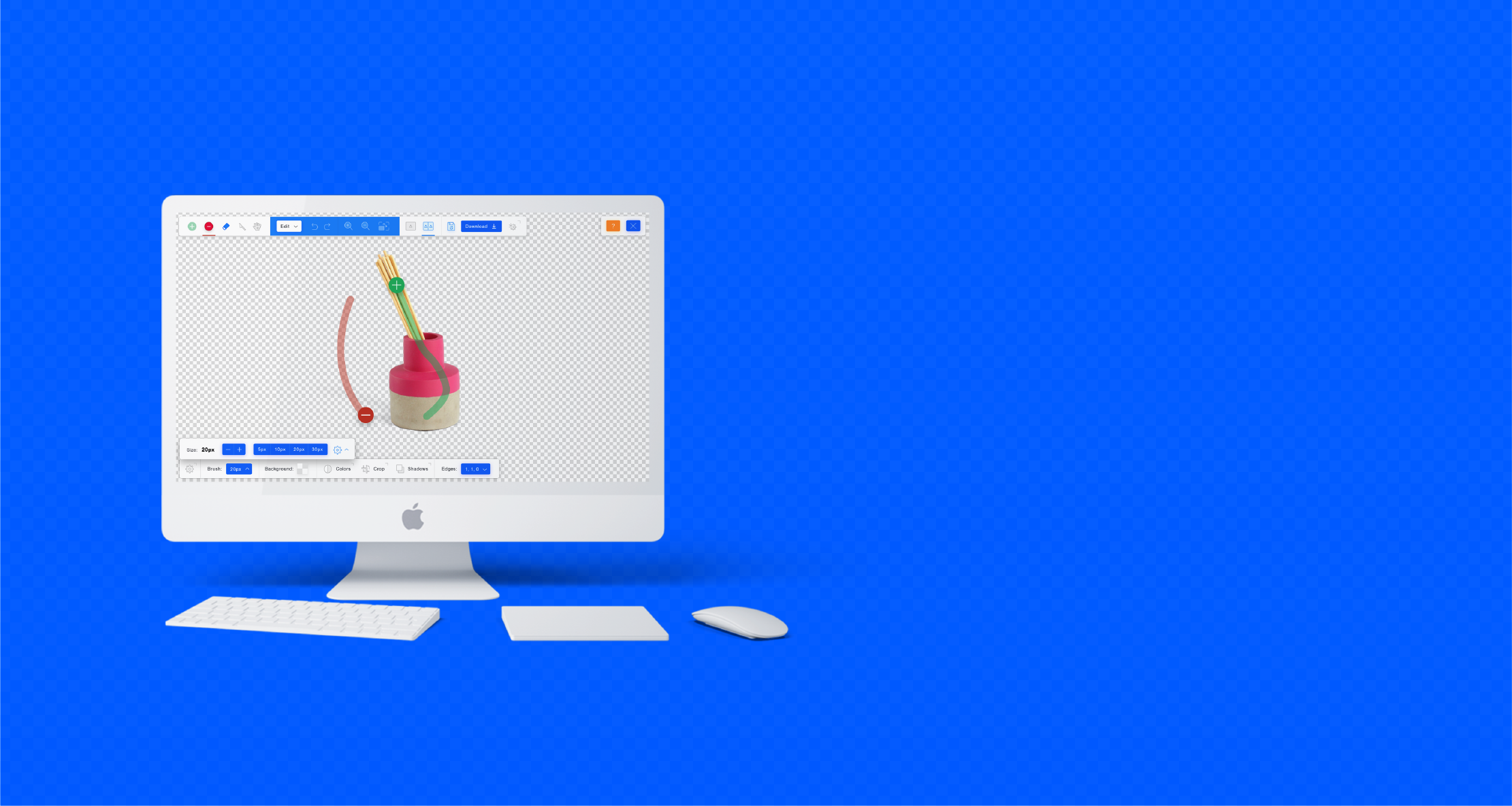
Clipping Magic is an online background removal app.
It’s faster and more intuitive to use than Photoshop which makes it a popular choice for many e-commerce businesses. Recently it has encountered more competition from other online providers and needed a redesign that would help reflect and keep its dominate position in the market. This is the webapp portion of the redesign.
Design Update
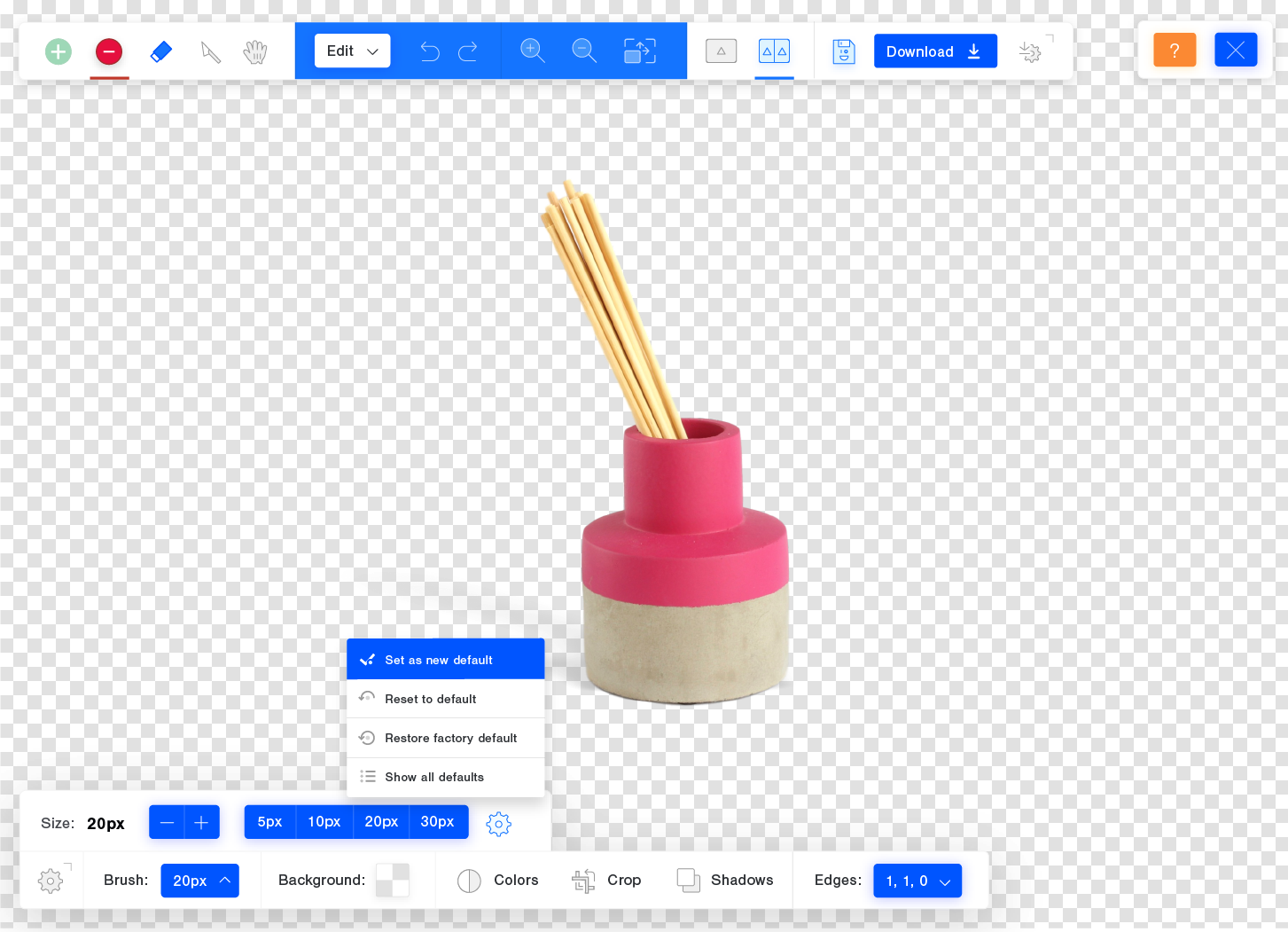
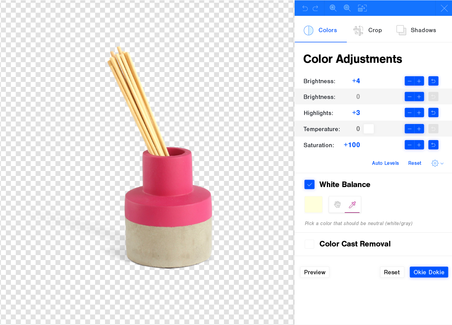
The redesign for the desktop version was primarily a styling update. Things mostly kept the same structure, but got a new veneer. Small UX updates were made where appropriate.
Making it more responsive
The previous implimentation had several bugs when viewed on mobile screens. Thus the redesign to the responsiveness of the webapp had structural changes to it, as well as the visual changes.
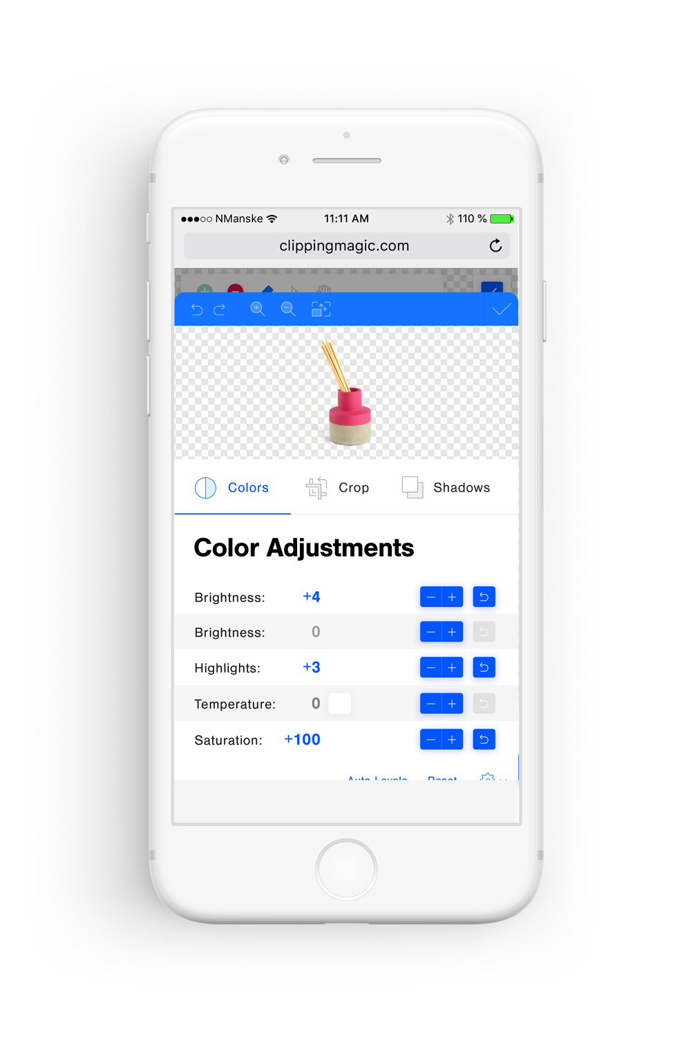
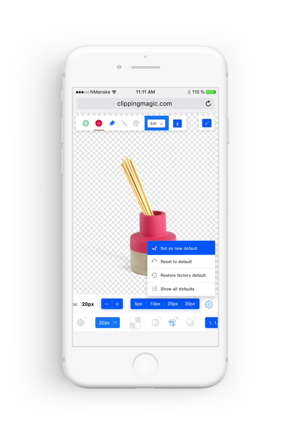
Only a tiny amount of our users used the tool on a mobile device, but we still wanted to support mobile, so we went for a desktop first approach. Everything that could be done on the desktop version could be done on mobile, but we didn’t spend the time to truly optimize the experience for mobile.
Design System
I created a design system for the app that would be flexible, compact, and work on a variety of screens.
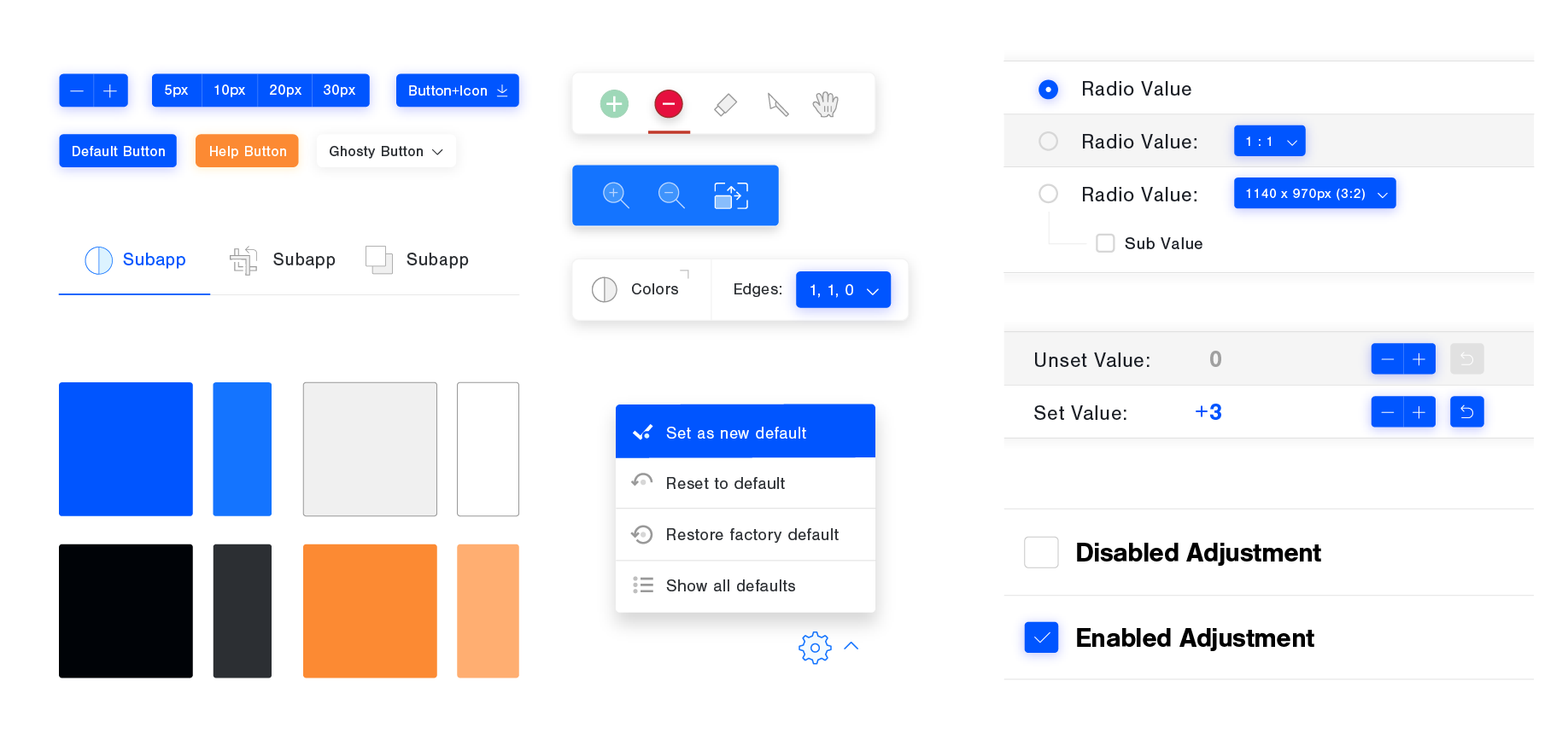
Iconography
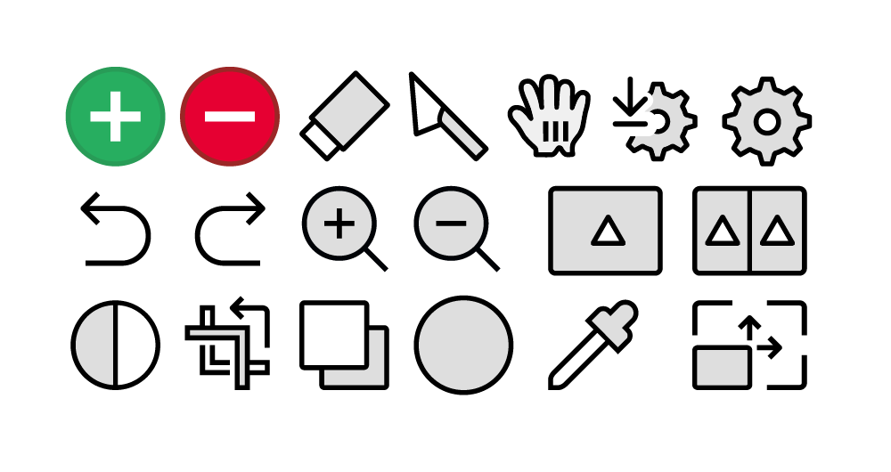
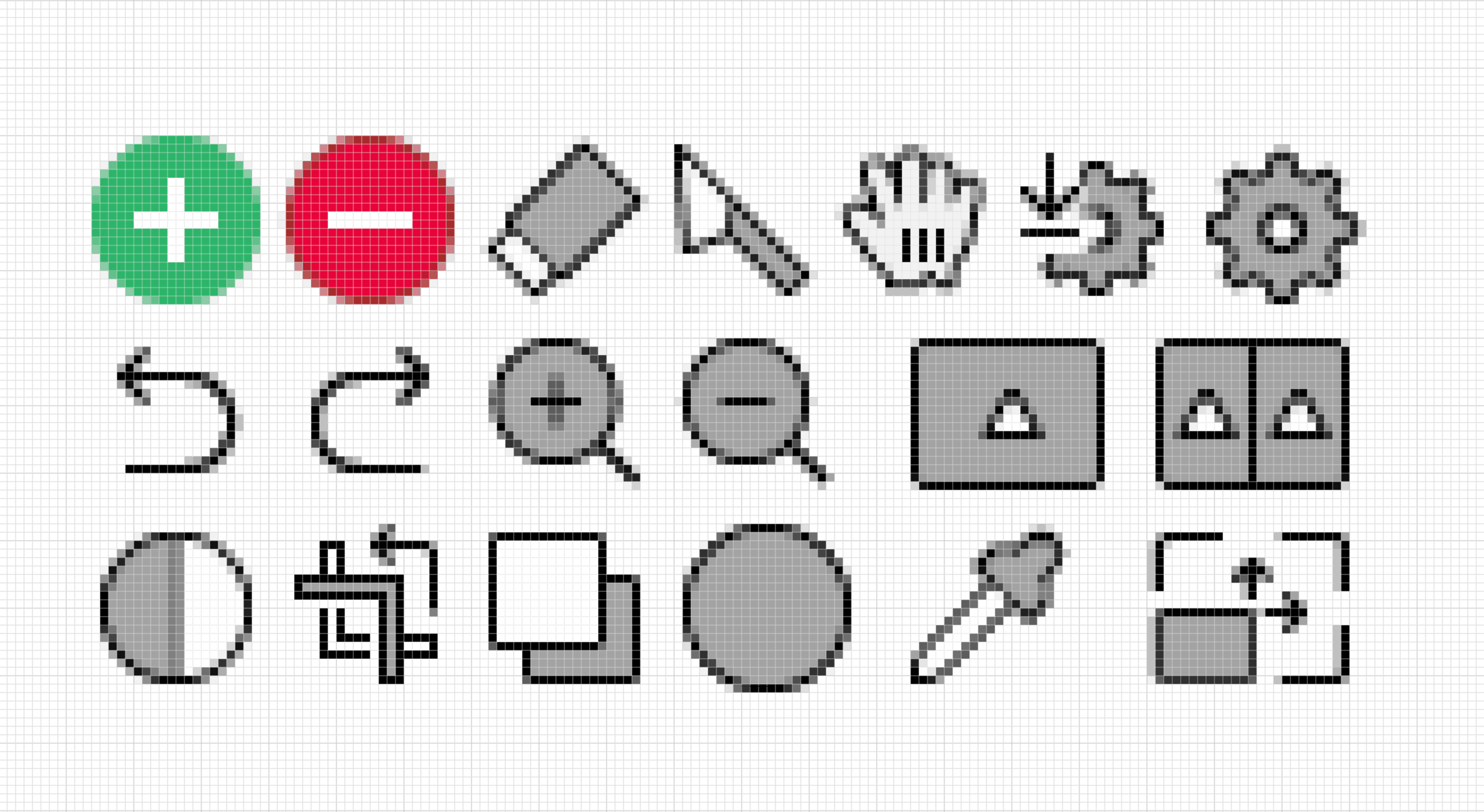
Each icon used on the webapp was optimized to be pixel perfect. This was to ensure they were comprehensible and looked great on any pixel density screen.
I also added in some fun little micro interactions where I could. When I updated the save icon paradigm, I also added in a little micro interaction.
Onboarding UX
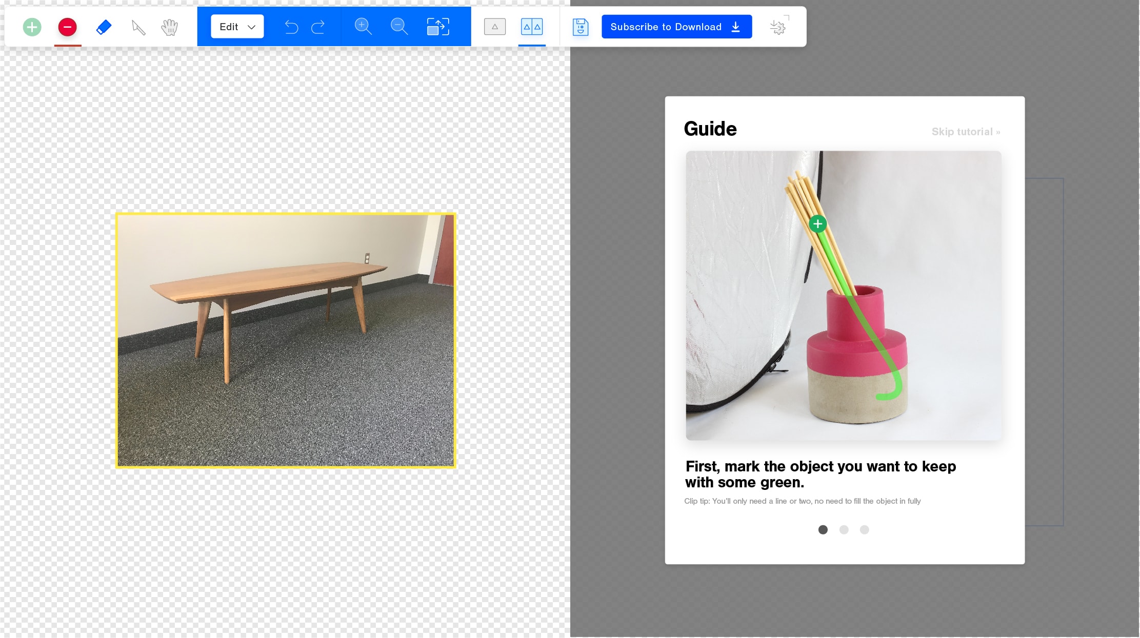
We decided to switch the onboarding paradigm from an intro video to a paradigm that walked new users through the basics of the tool. It was kept as short and simple as possible, but would ensure that all new users would understand the basics.